How To Build My Own Website (3) - Style
Contents
- The choice of Next.js
- Parse and Display Markdown
- Style my website
- Image Optimization
Tailwindcss
When considering styling, what comes in my mind is to choose a CSS framework. Tailwindcss wins against other popular frameworks, like Bootstrap and Foundation. The main reasons are:
I have used Bootstrap for beginning, as it is the most widely used CSS framework and has React supported. However, I found it is too powerful, making customization difficult.
I haven't used Foundation. I am happy to try it, but it seems a little hard to start with.
Tailwindcss is light, and most importantly it is highly customizable. As it says:
Rapidly build modern websites without ever leaving your HTML.
A utility-first CSS framework packed with classes like
flex,pt-4,text-centerandrotate-90that can be composed to build any design, directly in your markup.So we can easily understand what is behind these styles, and compose whatever css properties to achieve the desired style.
I am familiar with the raw CSS styles. Tailwindcss pre-defines almost all the common styles in so called utility classes. So I can quickly style an element without writing any CSS code. Besides, VSCode has Tailwind CSS IntelliSense to help me quickly tap utility classes.
Below is an example of using tailwindcss in my website.
<div className="text-xs text-theme-meta absolute bottom-2 flex flex-col sm:flex-row sm:items-center">
  <DateFormatter dateString={post.date} />
  <Dot className="mx-2 border-theme-meta hidden sm:block"/>
  <span>{`${post.readTime}min read`}</span>
</div>
In this block of code, I used
- customized color:
theme-meta, sotext-theme-metamakes the color of the text as I defined. - responsive design:
sm:flex-row sm:items-center, so theflex-directioniscolwhen the screen width is smaller than 640px, otherwiserow, and thealign-itemsisstartwhen the screen width is smaller than 640px, otherwisecenter.
Theme Color Configurable
As Tailwindcss enables highly customization, I can define my own favor theme in tailwind.config.js. This configuration file is javascript, which means I can use variables, functions, etc. So it is easy to make my theme color configurable.
const colors = require('tailwindcss/colors');
const themeColor = colors.red;

module.exports = {
  theme: {
    extend: {
      colors: {
        theme: {
          meta: colors.coolGray[500],
          link: {
            DEFAULT: themeColor[500],
            highlight: themeColor[700],
            disable: themeColor[400],
          },
          bg: {
            DEFAULT: themeColor[300],
            light: themeColor[200],
            strong: {
              DEFAULT: themeColor[500],
              text: colors.white,
            }
          },
          border: {
            DEFAULT: themeColor[300],
          },
          line: {
            DEFAULT: themeColor[200]
          }
        },
      },
    },
  },
}
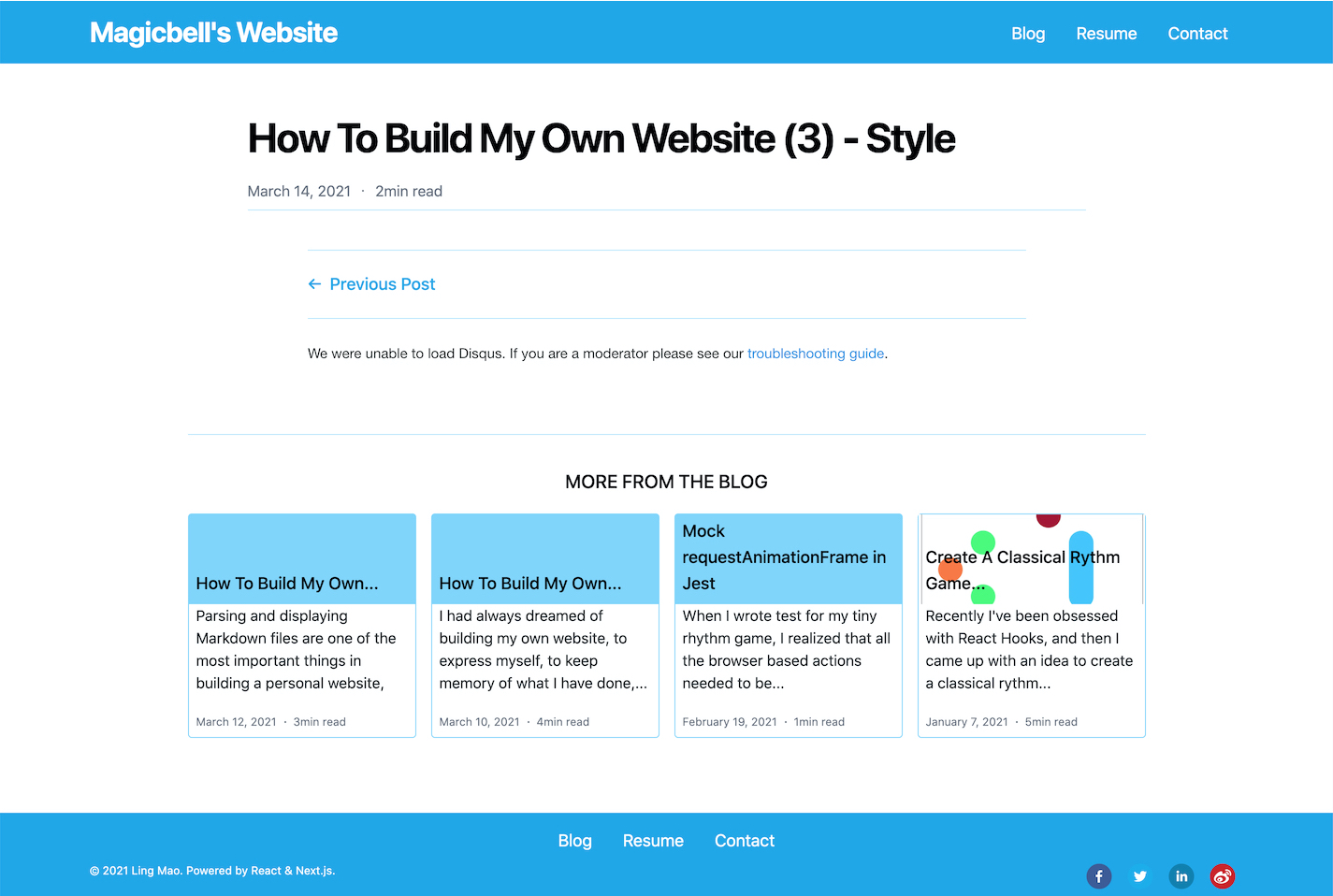
So if I change the themeColor from colors.red to colors.lightBlue, the result will be like this:

It looks also pretty cool. The color can be any color you what, in hex or rgb.
In addition to colors, there are many more properties can be extended or overrided, like padding, fontSize, boxShadow, etc. For details, check the doc.
Animation
For page scrolling effect, which bumps up content one by one, I use the AOS. It earns many github stars. It supports many effects like fade-in, flip, zoom, etc. The installation and usage is quite simple.
After installing, I put the initialization code in the React useEffect hook in _app.js.
export default function MyApp({ Component, pageProps }) {
  //...
  useEffect(() => {
    AOS.init({
      once: true,
    });
  }, []);
  //...
}
Next.js uses the App component to initialize pages. We can override it with our customized component for adding features to the page initialization.